
Focus: Color approval
Color is not just a number
Delta E, the contract proof and color management in the production process

Colors are deeds of light, deeds and sufferings.
Johann W. Goethe, Theory of Colors, 1810
The artwork looks stunning on the screen, doesn’t it? Fantastic. Excellent work. The digital mock-up is perfect, all stakeholders have given it the green light, the client is happy and so is the team. Now it’s time for production.
The files are properly finalized, the color space is correct, and the profiles have been embedded in both the document and the placed files. The supplier receives the data and the contract proof (the binding color reference) and they don’t find any problems. CtP (computer-to-plate) imaging runs without any dramas and the printing machines start rolling.
After the usual lead time for printing and finishing, plus two to three weeks in transit, the finished sample finally arrives at the company. The sample is taken to the viewing booth – a standardized viewing environment for color assessment – where it is placed alongside the certified contract proof.
The Delta E value (ΔE), which is used to quantify visual difference, reveals that the variation between the reference colors and the printed colors is between 0.8 and 1.5 – a more than acceptable result. And yet, our eyes see two different results. Our expectations collide with reality.
Why colors change between the contract proof and the finished product
The printing process inherently involves a discrepancy between
- a) what we produce on our screens and compare with the contract proof, and
- b) what can physically be reproduced in production.
This unavoidable discrepancy is the culmination of many factors.
There are hundreds of substrates of the same type and with the same name, but which are made by different companies – and they each have their own characteristics. There are printing and finishing machines built using different technologies and configurations. And then there are inks, varnishes, adhesives, films and other consumables, each with their own properties.
All of these elements influence the end result, not least by reducing the range of colors the process can reproduce (color gamut). The substrate, the lamination or a varnish applied to a detail can profoundly change how a product is visually perceived, on packaging as well as in publications (Source: Fogra).
The printed result can match the contract proof. The RIP (raster image processor) can adapt the color separation to the printing conditions and the substrate. But there are limits that no conversion can overcome.
It’s important to remember that the finished product is no longer just the result of printing. After printing comes lamination, varnishing, mounting onto board, hot foil stamping, creasing, folding and further processing steps. The contract proof represents a reference but often cannot fully demonstrate what happens to the product through all these stages.
So, a color mismatch is not necessarily the result of a production error. Such issues are more likely to occur when the desired result was never defined in relation to the real production conditions. Learn more: The role of prepress
Another round of sampling and several more months to correct the color
Usually, discrepancies between the sample and the proof trigger a flurry of emails, calls and complaints, culminating in the supplier requesting a new round of sampling.
This time the contract proof is taken ‘more seriously’ by the supplier. Perhaps the substrates used in the production are changed. Perhaps finishing processes such as lamination, hot foil stamping, blind embossing or spot varnishing are taken into account to produce a better visual match between the contract proof and the finished product.
The second sample arrives at the company and is taken to the viewing booth. This time, the contract proof and finished product look alike.
But the Delta E values between the colors of the contract proof and those of the sample are now 3 to 4. Marketing might approve the full production run, but quality assurance certainly won’t.
Another couple of months slip by.
Learn more: Sampling rounds in packaging: The problem isn’t the PDF file
Same sample, opposing verdicts: Spectrophotometer versus human color perception
Delta E is calculated from measurements on small color patches, using a defined measurement geometry. By contrast, the human eye looks at the whole object and also perceives how the surface reflects the light. A matt lamination or a glossy varnish can change our perception of saturation, contrast and perceived color depth, even when the measured value stays almost the same.
Delta E can therefore validate a sample that the eye rejects, and vice versa.
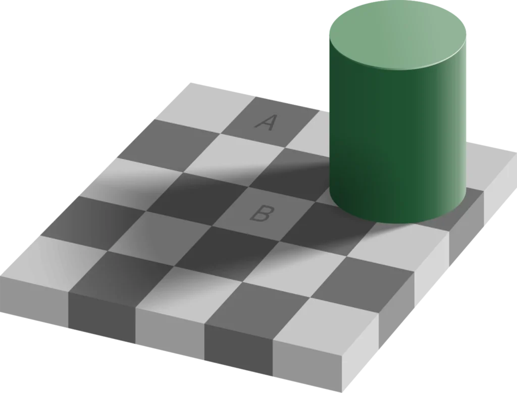
The measured value is important for monitoring production and keeping it as close as possible to the reference. But it cannot replace a human assessment of the finished product, because the eye perceives the whole picture.
The decision cannot be made based on a single number. The measured value and the visual assessment must be considered together, according to criteria that are defined before production starts (Source: X-Rite). Rigidly aligning the process to numerical values means, in some cases, ignoring what the product actually conveys and risking further sampling rounds – which in turn wastes time and money, and is frustrating for everyone involved.
The aim of color management is not to achieve the correct number. It is designed to make physical results predictable.
Color management: Client and supplier must speak the same language
The supplier is responsible for the production method: the machine, profile, inks and internal processes. By contrast, the client is responsible for creating a contract proof that takes into consideration the agreed finishing specifications and the capabilities of the supplier.
For that to be possible, the artwork and contract proof cannot be created in isolation. They can only be made following a discussion with the supplier. What can the supplier deliver, what are their limitations, and what substrates do they use? This information is handed over alongside other specifications and a clear requirement: The artwork and contract proof must accompany the production process all the way through to finishing. They must not disappear once the printing is finished. Learn more: What “production-ready” actually means
Under these conditions the supplier does not simply receive a PDF containing artwork to reproduce. They receive a contract proof that they know they can implement, and they bear the responsibility for ensuring that the reference is adhered to in accordance with the agreed process.
How to assess a contract proof before approving it
The first stage of a reliable color approval process is to make sure that everyone knows exactly what is being approved. Without this agreement upfront, it will be impossible for the team (or the client) to correctly assess the proof.
Under what conditions must proofs be viewed? What factors are important to bear in mind? What can be expected after a matt lamination or a varnish? Which deviations are inherent to the process, and which ones indicate a problem?
Color depends not only on the object but on the light that illuminates it. That is why the viewing booth is so vital. Two samples that match under one light can diverge under another (metamerism), and substrates with optical brighteners (OBAs) react differently depending on the spectrum of the light source.
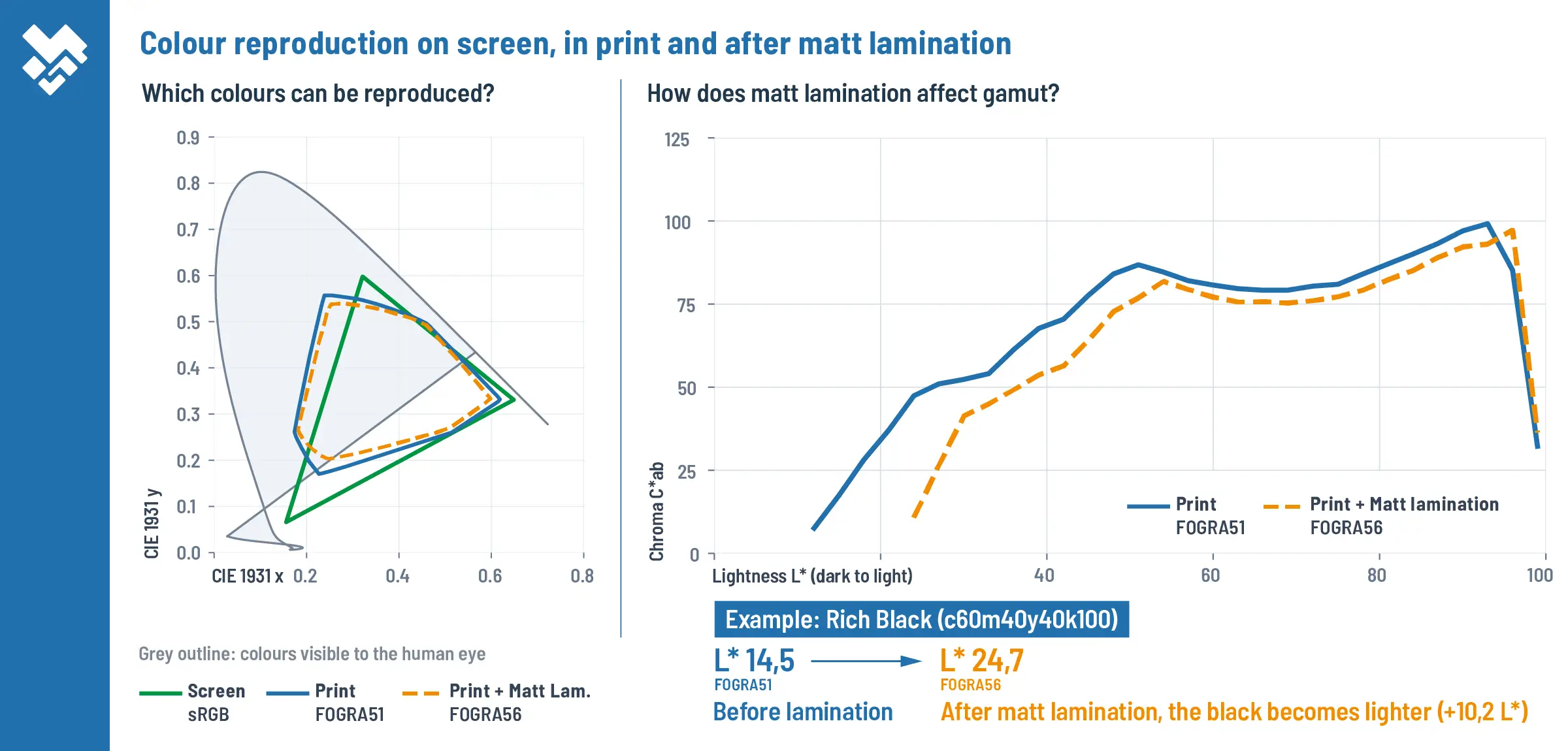
To accurately assess a contract proof, you need standardized viewing conditions, the same assessment criteria for all stakeholders, and an awareness that a finish can considerably change a color’s appearance (Source: ISO 3664:2025).
Proofs must not only be produced correctly – they must also be interpreted correctly.
Color management and contract proof: What ppress.pro offers
ppress.pro takes color management off the screen and into the production process.
We provide expert advice and supply, profile, and calibrate software, printers, RIPs, viewing booths and spectrophotometers. We train the people involved so that they can produce and assess reliable contract proofs.
We collaborate directly with production suppliers using their technical language and translate our client’s color objectives into requirements that can be applied to the real production process.
The result is not a ‘perfect’ color value in the numerical sense. It is a defined, verifiable result that is unanimously agreed upon before production starts.
At ppress.pro, we create the right conditions in advance so that the first sample is the right one. We define the contract proof, know the production process, check the supplier’s limitations, and determine how the result will be assessed.
When problems are primarily identified and prevented upfront, there are fewer issues that need to be solved during sampling. And every sampling round you avoid means fewer shipments, less time spent waiting, fewer changes to the artwork, lower costs, and less work for everyone involved.
Our approach is not only about controlling color more effectively. It’s about making the entire production process more predictable, faster and more cost-effective (Source: Heidelberg).
Remember that meeting in the viewing booth, where the long-awaited sample didn’t look quite like the contract proof? With ppress.pro, that scene plays out quite differently. Members of the marketing and quality assurance teams enter the booth with the contract proof, which they had all approved in advance. They place it alongside the sample, which the supplier was able to produce because they knew exactly what was required and how to achieve it.
Everyone agrees it’s a match.
The sample is approved and the full production run can start. Voilà!
PPRESS.PRO
Lock in reliable and predictable print results, before production begins.
Let’s talk.